Striim: Summer 2019 internship
May 2019-Aug 2019
OBJECTIVE
The Striim platform allows users to ingest, process, and deliver real-time data across diverse environments in the cloud or on-premise. As a growing startup, the Striim team has been focusing heavily on the Striim platform's user experience. They also desire to reach a wider user base including folks who may not be experts in data analytics. As part of this internship, my goal was to (a) Redesign the on-boarding to the platform to make it more accessible to novice users, (b) Redesign the home page and navigation bar to allow efficient navigation across the platform for both new and regular users and (c) design a Sketch library to allow other designers in the team to design consistent designs with ease and efficiency.
METHODOLOGY
After spending a week getting acquainted with the Striim platform and understanding its functionality and objectives, I performed task analysis (for the major tasks) and heuristic evaluation to understand the major usability challenges of the platform. Following this, I performed semi-structured interviews with the technical team, sales and support team and new interns who just started using the platform. As a business to business company, it is tough to directly interview clients, but I was able to interview two of Striim's major clients (one online and one in person). I also forwarded a survey to the sales team to forward to the clients to receive their feedback. Unfortunately, due to customer relations, sharing that was not possible. The major objective of the interviews and survey was to understand (a) the users and the range of technical abilities, (b) frequent use cases, (c) major usability issues, (d) current navigation techniques, (e) current on-boarding and design challenges. I transcribed the interviews and performed descriptive coding. I organized my codes using affinity mapping to highlight the major design problems and challenges. This was followed by a brainstorming session to come up with design ideas. Next, I collected feedback on my initial designs from the sales and support team who frequently talk to clients and thus are aware of their problems. I iterated the designs based on the received feedback. Alongside the research and design process, I also designed a sketch library for the design team at Striim.
USER RESEARCH
A flexible set of questions for the semi structured interviews conducted with the Sales and Engineering teams at Striim can be found here.
Survey questions that would help receive quick feedback from our clients can be found here. The survey was designed using Google Forms.
Findings from the user research can be found here.
NAVIGATION BAR DESIGN
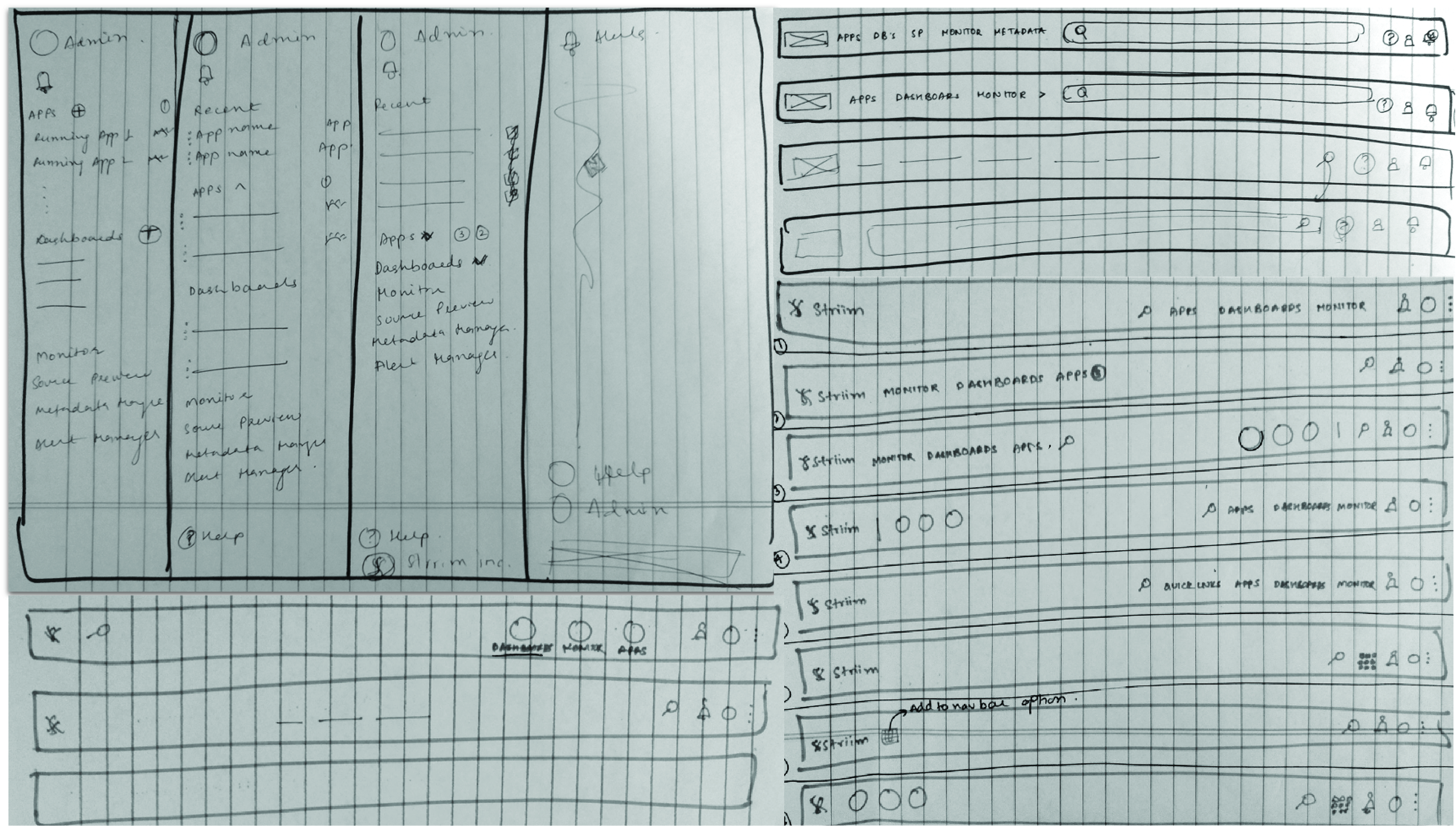
Image 1: Initial Navigation Bar brainstorming and wireframing

Image 2: Navigation Bar redesigned

Image 3: Navigation Bar highlights
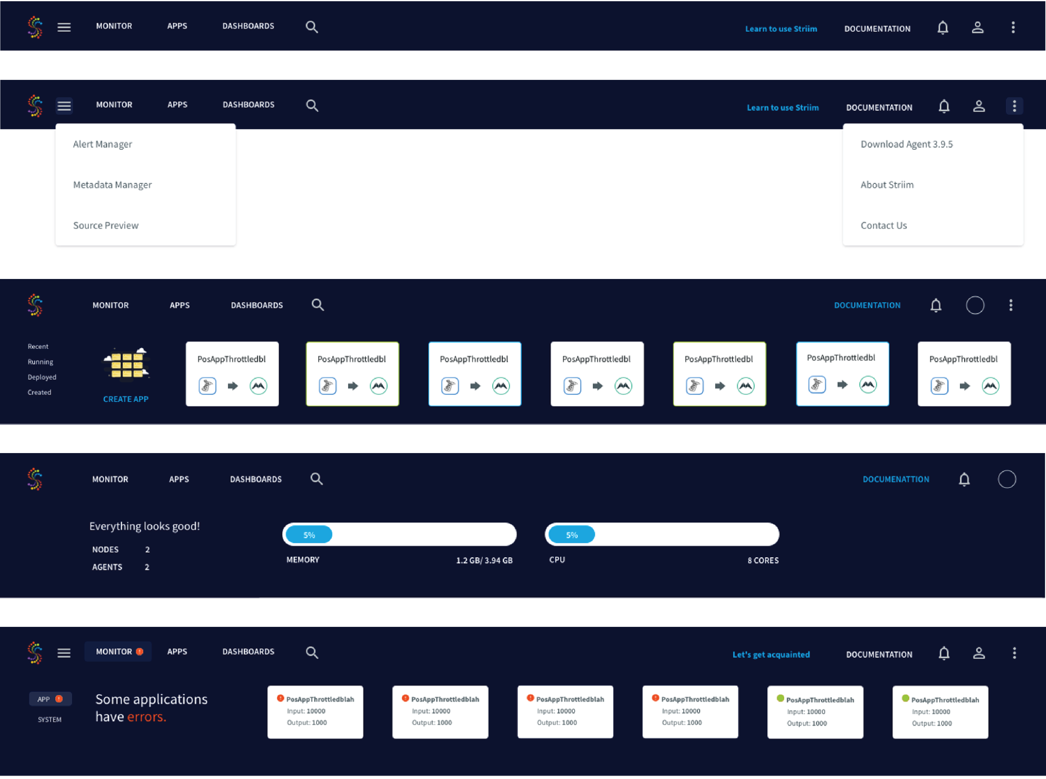
Image 4: More Navigation Bar modes and designs
HOMEPAGE DESIGN
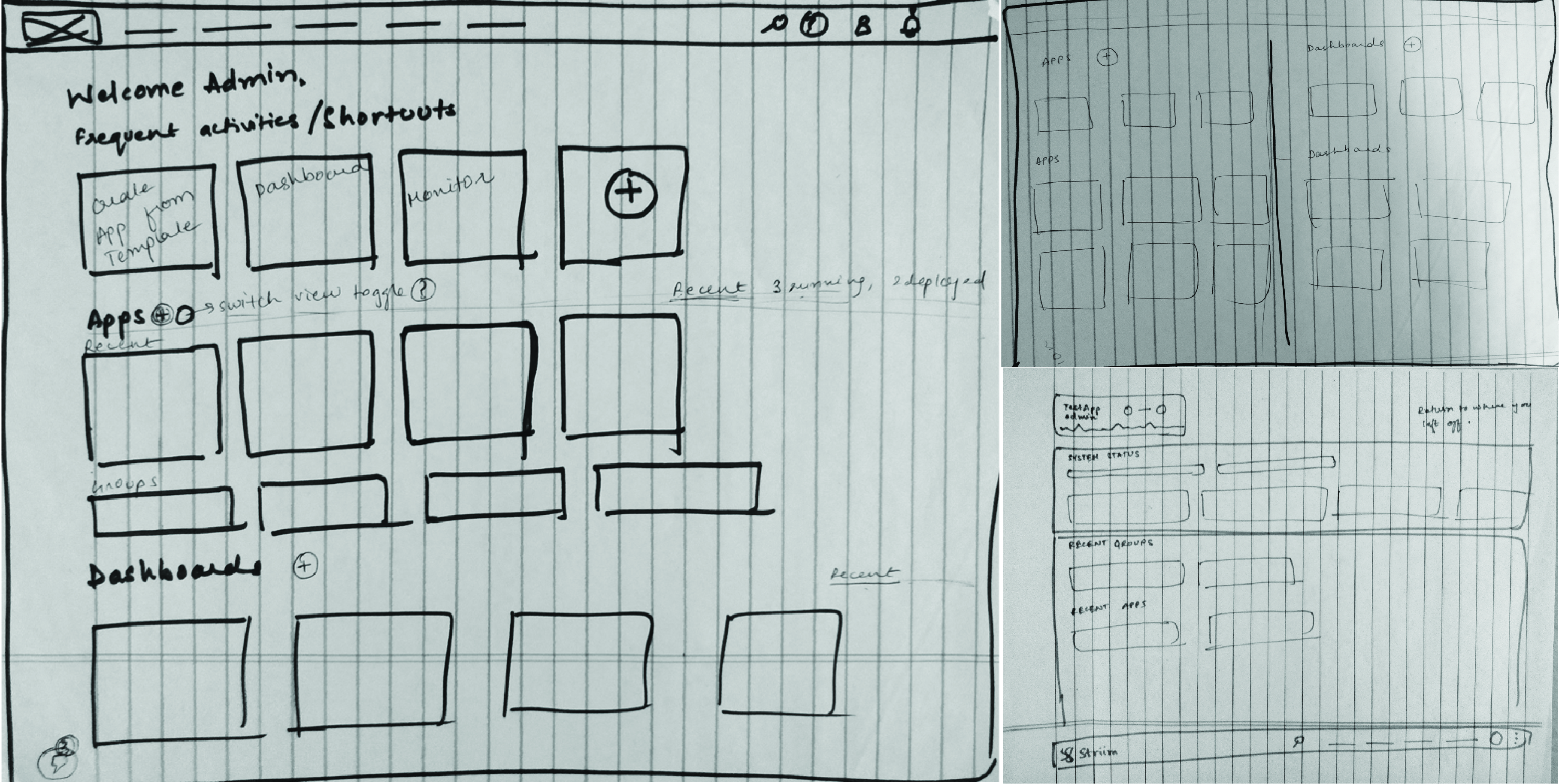
Image 5: Initial homepage brainstorming and wireframing
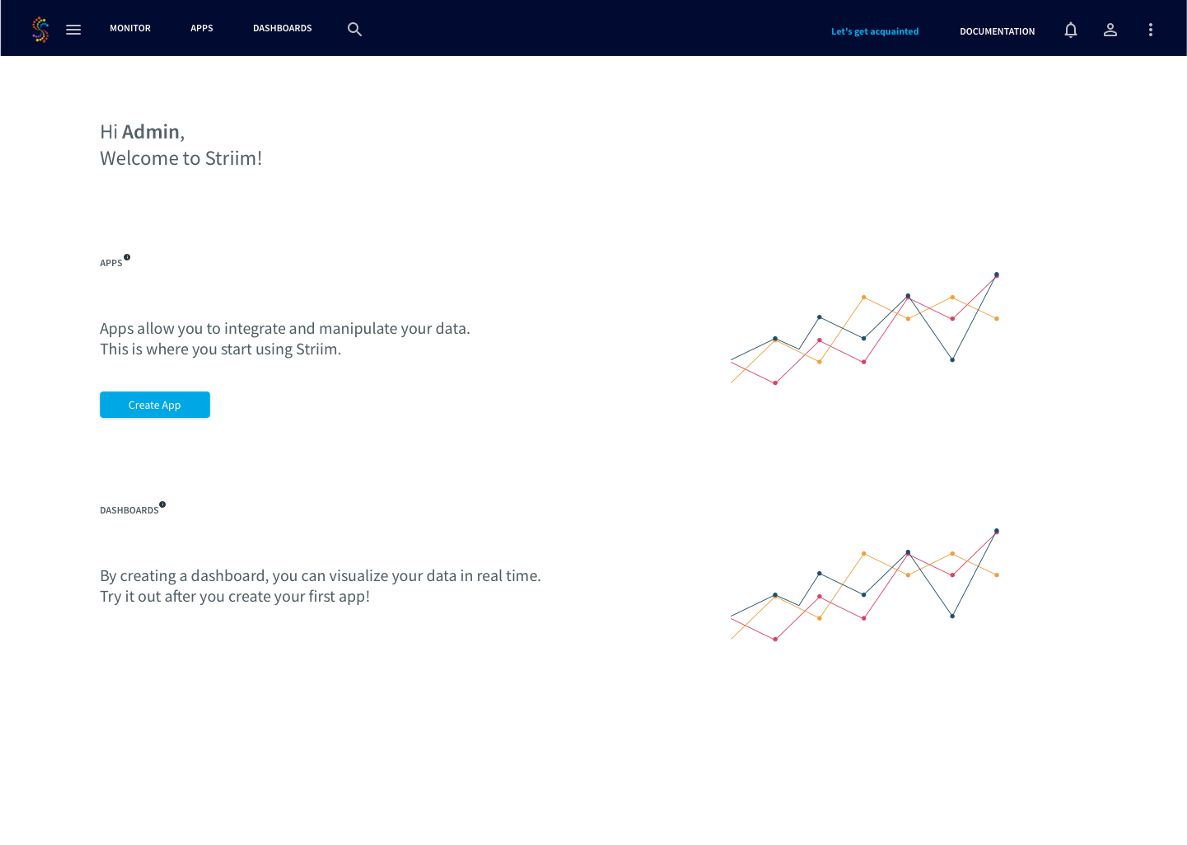
Image 6: Homepage for new users
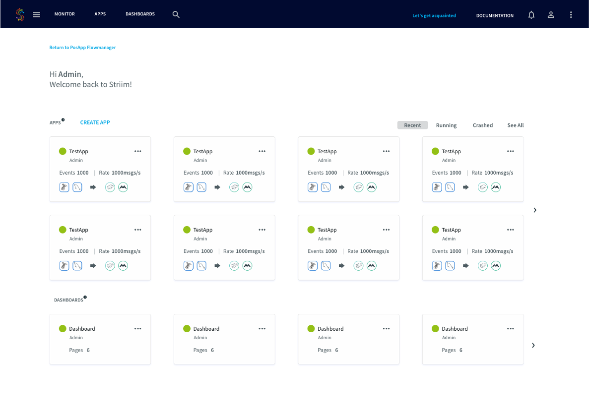
Image 7: Homepage for returning user
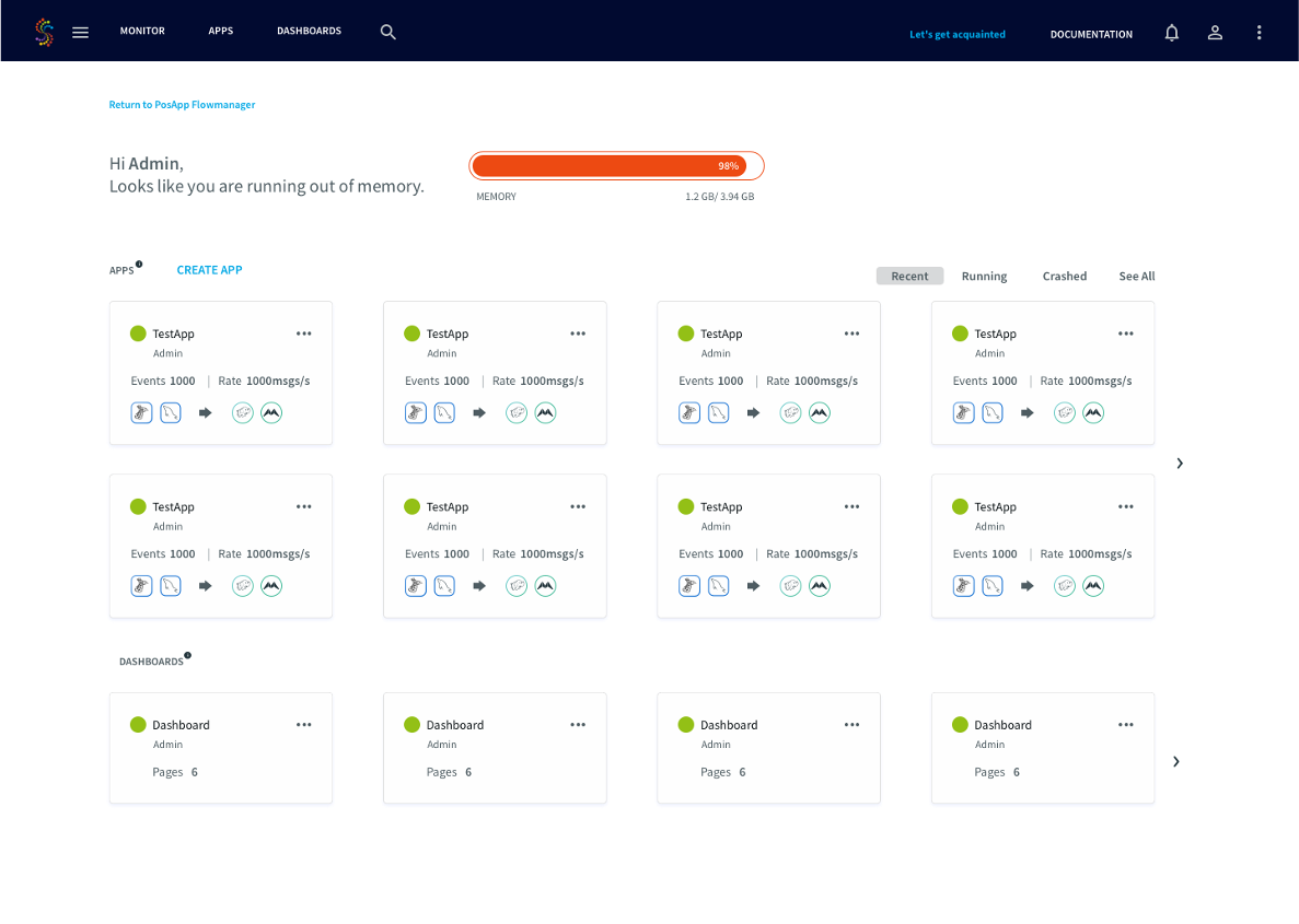
Image 8: Homepage for returning user with an error message
ONBOARDING DESIGN
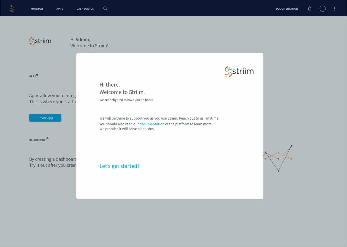
Image 9: Onboarding design 1
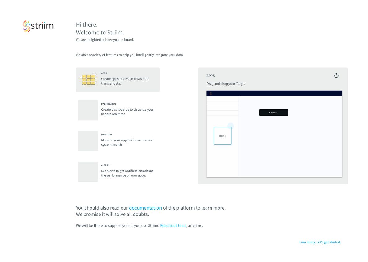
Image 10: Onboarding design 2
SKETCH LIBRARY
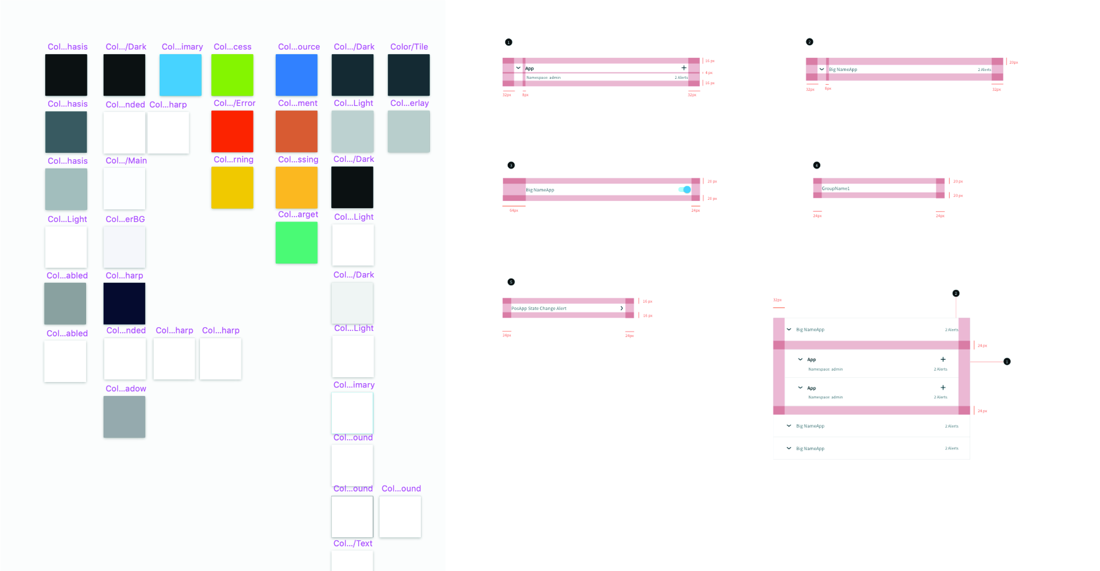
Image 11: Snapshot of the Sketch Library